
Another way to get people's attention to click on a photo is to turn it upside down. This will give urge their curiosity and once they hover their mouse pointer over it, the right position of the photo will turn out. The code is simple via CSS and i believe you can follow the instruction smoothly. There are two ways to flip a photo, either by its X axis or through Y axis. Just choose which one you like.
1. Prepare the photo you will use. Choose small sizes first preferably 200x200, you can experiment with bigger one later.
2. Go to <head>, again read how to edit the <head> here. Just below it paste the following codes:
<style>
div.flip{
position:relative;
width: 300px; /* Set default width of flip */
height: 250px; /* Set default height */
-webkit-perspective: 600px; /* larger the value, the less pronounced the 3D effect */
-moz-perspective: 600px;
-o-perspective: 600px;
perspective: 600px;
}
div.flip div.rotate{
width: 100%;
height: 100%;
-moz-transform-style: preserve-3d; /* Specify all child elements inside this DIV maintain the same perspective */
-webkit-transform-style: preserve-3d;
-o-transform-style: preserve-3d;
transform-style: preserve-3d;
-moz-transition: all 0.6s ease-in-out 0.3s; /* final 0.3s specifies delay before effect kicks in */
-webkit-transition: all 0.6s ease-in-out 0.3s;
-o-transition: all 0.6s ease-in-out 0.3s;
transition: all 0.6s ease-in-out 0.3s;
}
div.flip div.rotate > *{ /* Target all children elements */
position:absolute;
width: 100%;
height: 100%;
-moz-backface-visibility: hidden;
-webkit-backface-visibility: hidden;
-o-backface-visibility: hidden;
backface-visibility: hidden;
}
div.flip div.rotate > div{ /* Target all child DIVs */
-webkit-box-sizing: border-box; /* Specify that any border/ paddings do not add to the DIV's total width */
-moz-box-sizing: border-box;
box-sizing: border-box;
padding: 8px;
background: #eee;
}
div.rotate.x *:nth-child(2){ /* X Axis rotate specific CSS. Rotate 2nd child DIV 180deg in the X axis */
-moz-transform: rotateX(180deg);
-webkit-transform: rotateX(180deg);
-o-transform: rotateX(180deg);
transform: rotateX(180deg);
}
div.flip:hover > div.rotate.x{ /* X Axis rotate specific CSS. Rotate div.rotate.x when mouse rolls over container */
-moz-transform: rotateX(180deg);
-webkit-transform: rotateX(180deg);
-o-transform: rotateX(180deg);
transform: rotateX(180deg);
}
div.rotate.y *:nth-child(2){ /* Y Axis rotate specific CSS. Rotate 2nd child DIV 180deg in the Y axis so it mirrors the first */
-moz-transform: rotateY(180deg);
-webkit-transform: rotateY(180deg);
-o-transform: rotateY(180deg);
transform: rotateY(180deg);
}
div.flip:hover > div.rotate.y{ /* Y Axis rotate specific CSS. Rotate div.rotate.y when mouse rolls over container */
-moz-transform: rotateY(180deg);
-webkit-transform: rotateY(180deg);
-o-transform: rotateY(180deg);
transform: rotateY(180deg);
}
</style>
3. Save it. Now go the the page you want and drag an "embed tool" and insert the following code:
<div class="flip" style="display: inline-block; margin-right: 40px; height: 330px">
<div class="rotate x">
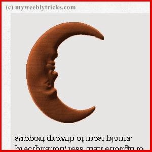
<img src="http://theweeblytricks.weebly.com/files/theme/moon.png">
<div>
(Sample text ONly).. region that receives an extremely low amount of precipitation, less than enough to support growth of most plants.<br /><br />
<img src="http://theweeblytricks.weebly.com/files/theme/moon.png" style="margin:0 auto" />
</div>
</div>
</div>
<div class="rotate x">
<img src="http://theweeblytricks.weebly.com/files/theme/moon.png">
<div>
(Sample text ONly).. region that receives an extremely low amount of precipitation, less than enough to support growth of most plants.<br /><br />
<img src="http://theweeblytricks.weebly.com/files/theme/moon.png" style="margin:0 auto" />
</div>
</div>
</div>
4. Pay attention to the height that can be changed according to the image size you will use plus the space of the description if any. The rotation can be changed by x or y, just look at the demo. Now change the website address in there with yours and the "moon.jpg" with the name of the photo you used. The yellow highlighted part will be your image description. If you don't have any description, just leave it blank.
5. You're done! Share if you like!


0 comments: